Monday, November 16, 2009

Bob Dylan's Brain. Milton Glaser's Design.

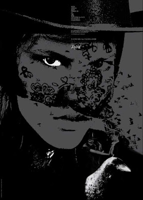
This is an image from a 2008 Vanity Fair magazine article. Since we're looking at Postmodern design, I thought this would be a good example of the old (1966)


becoming new again and the use of typographic space that's not on a grid. Imagine creating something with this typographic detail before design software was available.


Monday, November 9, 2009

Fuel

Neat movie poster - with a message. Would this be considered conceptual art?


I had an idea...

If anyone ever actually reads this blog, do me a favor...in the comments section below this post, type in the name of one object (e.g., chair, tea cup) -- any object will do -- and I will do 50 sketches of it and will post them.  I need something to sketch and you can be my inspiration!

Sketching

Karly Barrett is a designer who was gracious enough to include sketches she did while developing a logo for bioTrekker - an interesting environmental campaign. I like reading her blog because she includes lots of info about the process of designing. She gives a great description of the process on her blog but I'm just including the images here. I've had a really hard time getting myself to sketch every day even though I know that by doing so, my graphic design work would improve. I've heard this from more people than I can remember. It just doesn't come so naturally to me. This will be good inspiration.


Monday, November 2, 2009

Great Danes

After watching Helvetica in class last week, I had a lot of fun doing web searches on the various designers the movie featured. I have dozens of blog posts in the wings now. For many of the sites I found, I have no idea what series of clicks led me there. The web is just a great thing. I found a site that allows you to create "word clouds." You can look at my Typography blog if you're interested or go here.

I also found a really interesting Danish design company called e-types. I have often thought of myself as a minimalist and was initially really excited about finding this company. As I went through the numerous projects they'd done, however, I began to get a little bored! Their aesthetic seems to be very much in line with the Swiss International style. To their credit, they put a little twist on it sometimes and don't align everything just perfectly. Here are a few of their designs I like.

The Danish Arts Council logo was my favorite. Their materials describe the Arts Council as supporting artwork that "pays tribute to art that goes against the grain of society." If you look at the logo, you can see there's one little line out of place to represent going against the grain. Very subtle. Too subtle?


The next image is from a fashion ad for a company named Noir. Love the logo that's readable upside down and downside up. Clever.


Finally, I picked their treatment of a series of
DVD's about Denmark's history. I liked how the logo color was altered for each time period. As I look at these examples, I notice that they're all pretty dark. That was an unconscious process on my part. Dark thoughts.

e-types has a great website so check it out if you want to see some of their other designs.