I also found a really interesting Danish design company called e-types. I have often thought of myself as a minimalist and was initially really excited about finding this company. As I went through the numerous projects they'd done, however, I began to get a little bored! Their aesthetic seems to be very much in line with the Swiss International style. To their credit, they put a little twist on it sometimes and don't align everything just perfectly. Here are a few of their designs I like.
The Danish Arts Council logo was my favorite. Their materials describe the Arts Council as supporting artwork that "pays tribute to art that goes against the grain of society." If you look at the logo, you can see there's one little line out of place to represent going against the grain. Very subtle. Too subtle?

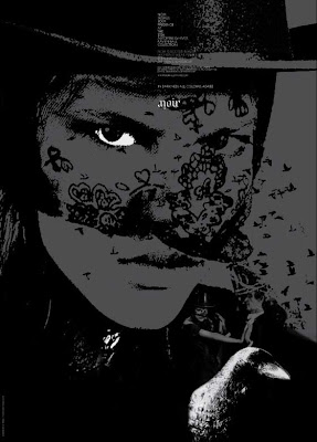
The next image is from a fashion ad for a company named Noir. Love the logo that's readable upside down and downside up. Clever.


Finally, I picked their treatment of a series of DVD's about Denmark's history. I liked how the logo color was altered for each time period. As I look at these examples, I notice that they're all pretty dark. That was an unconscious process on my part. Dark thoughts.
e-types has a great website so check it out if you want to see some of their other designs.


No comments:
Post a Comment